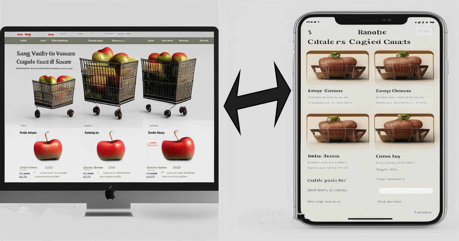
Building Responsive Websites with Flexbox and Grid
Emphasizing Flex-wrap and Auto-fit


Introduction:
In the rapidly evolving digital landscape, responsive web design has become a crucial aspect of creating successful websites. With a variety of devices and screen sizes in use today, it's essential to ensure that your website can adapt and look great across all platforms. In this article, we'll focus on using Flexbox and Grid, two powerful CSS layout tools, and highlight the importance of utilizing techniques like flex-wrap and auto-fit to build responsive websites that deliver an optimal user experience.
🚫 Note that the article won't explain the Flexbox and Grid however I will share with you great resources if you want to learn more about it
Understanding Flexbox and Grid:
Flexbox and Grid are CSS layout models that revolutionized web design by offering flexible and efficient ways to arrange elements on a webpage.
Click here to follow an openclassrooms course that covers Flexbox and Grid
Click here to read about Flexbox and here to read about Grid
The Power of Flex-wrap:
Flex-wrap is a crucial property in Flexbox that controls how flex items are arranged when they overflow the container's available space. By using flex-wrap, you can ensure that your content adapts gracefully to different screen sizes and orientations.
Importance in Responsiveness: Flex-wrap allows flex items to wrap to the next line when there is insufficient space, preventing content from overlapping or getting cropped. This feature is particularly valuable when dealing with long lists of items or flexible image grids.
Example Usage: Let's say you have a horizontal navigation menu with several items. By applying
flex-wrap: wrap;to the container, the menu items will automatically wrap to the next line when the viewport becomes narrow, ensuring all items remain visible and accessible.Example**Flex-wrap Example: Responsive Navigation Menu
  <!DOCTYPE html>
  <html>
  <head>
    <style>
      .nav {
        display: flex;
        flex-wrap: wrap;
        background-color: #333;
      }

      .nav-item {
        padding: 10px 20px;
        color: white;
        text-decoration: none;
      }
    </style>
  </head>
  <body>
    <nav class="nav">
      <a class="nav-item" href="#">Home</a>
      <a class="nav-item" href="#">About Us</a>
      <a class="nav-item" href="#">Services</a>
      <a class="nav-item" href="#">Portfolio</a>
    </nav>
  </body>
  </html>
Copy and paste the code into your code editor and open it in your browser and try to play with the browser window resize it and see how the navigation bar changes along the way
Leveraging Auto-fit in Grid:
Auto-fit is a powerful feature of the Grid layout that automates the creation of flexible and responsive grid structures. It automatically generates the necessary number of columns to fill the available space without the need to set a fixed number of columns.
Importance in Responsiveness: Auto-fit is an excellent tool for creating responsive grids that adapt to varying screen sizes. Whether the viewport expands or shrinks, the grid will automatically adjust, and the content will resize accordingly.
Example Usage: Suppose you have an image gallery displayed as a grid. By using
grid-template-columns: repeat(auto-fit, minmax(200px, 1fr));, the images will automatically adjust to fit the available space, maintaining a consistent layout without overflowing or creating gaps.
Importance of Using Flexbox and Grid Techniques:
Improved User Experience: Responsive websites built with Flexbox and Grid provide a seamless user experience across devices. Users can access your content on smartphones, tablets, or desktops without encountering layout issues or content misalignment.
Time and Cost Efficiency: Flexbox and Grid significantly simplify the process of creating responsive layouts. They reduce the need for media queries and complex CSS rules, allowing developers to achieve responsive designs more efficiently and cost-effectively.
Future-Proofing: As the variety of devices and screen sizes continues to grow, Flexbox and Grid offer a scalable solution to accommodate future devices without the need for major overhauls of your website's layout.
Example: Auto-fit in Grid Example: Responsive Card Layout
<!DOCTYPE html>
<html>
<head>
  <style>
    .card-container {
      display: grid;
      grid-template-columns: repeat(auto-fit, minmax(200px, 1fr));
      grid-gap: 20px;
    }

    .card {
      background-color: #f2f2f2;
      padding: 20px;
      box-shadow: 0 2px 4px rgba(0, 0, 0, 0.1);
    }
  </style>
</head>
<body>
  <div class="card-container">
    <div class="card">Card 1</div>
    <div class="card">Card 2</div>
    <div class="card">Card 3</div>
  </div>
</body>
</html>
Feel free to modify these code examples.
Conclusion:
Flexbox and Grid are powerful tools that empower web developers to create responsive websites with ease. By leveraging features like flex-wrap and auto-fit, we can ensure our designs adapt seamlessly to different screen sizes and orientations. Embracing these techniques not only enhances the user experience but also future-proofs your website, making it adaptable to emerging technologies and devices. So, when building your next website, remember to harness the capabilities of Flexbox and Grid to craft a visually appealing and user-friendly experience for all your visitors.
Follow me on Instagram
I work as a freelance software developer. I've got you covered if you need a web application, desktop application, automation solutions, or even SEO and design improvements for your existing page! 🌐💻✨
Contact me at code-with-amine@gmail.com and let’s build what you’re looking for. 🚀